
Product Display Components
Components for the product detail page - gallery, cards, tabs, variant pickers, and layout.
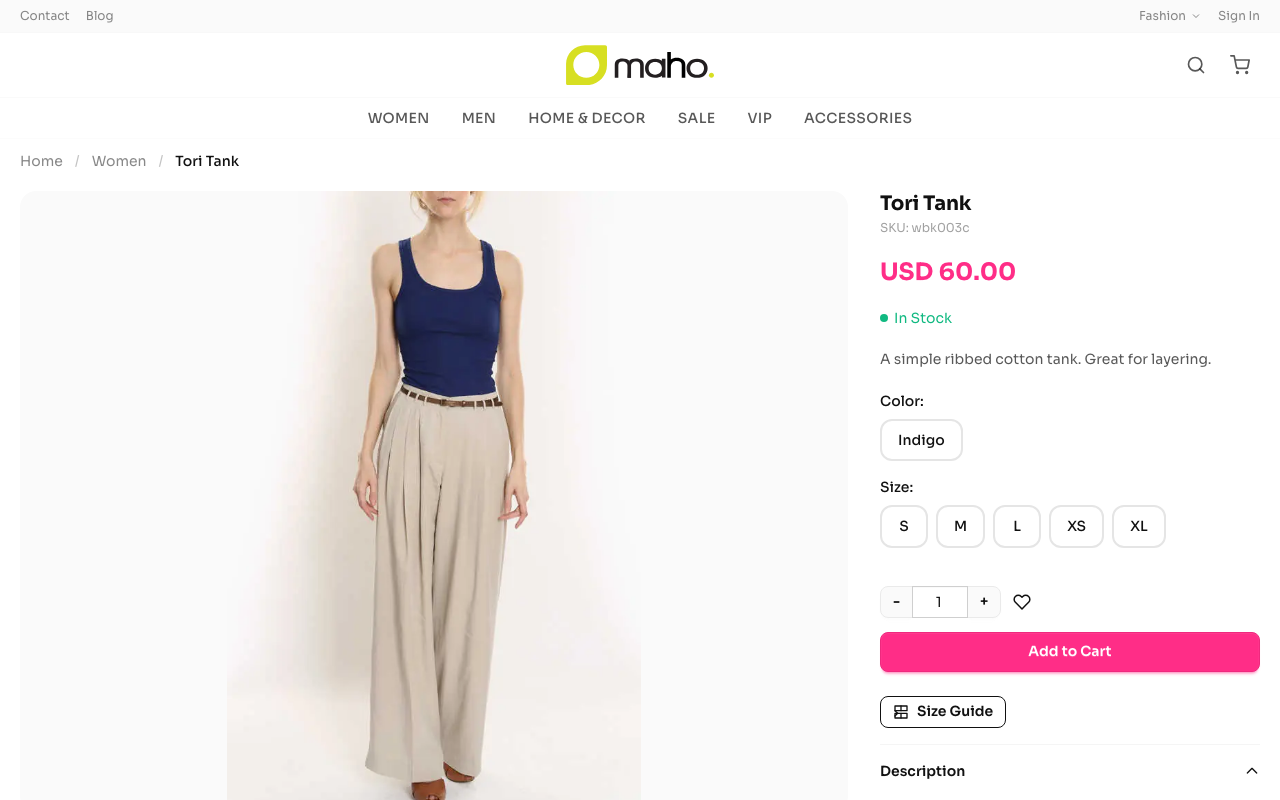
Component Slots
| Slot | Variants | Default | Description |
|---|---|---|---|
card | Standard, Minimal, Horizontal, Featured | standard | Product card in grids |
gallery | Carousel, Grid, Single | carousel | Product image gallery |
layout | Masonry | masonry | Product page layout |
variant-picker | Swatch, Dropdown, Button | swatch | Configurable option selector |
tabs | Accordion, Tabbed | tabbed | Product info tabs (description, specs, reviews) |
price | - | - | Price display with sale/tier pricing |
badge | - | - | Sale, new, out-of-stock badges |
quantity-stepper | - | - | +/- quantity selector |
sticky-atc | - | - | Sticky add-to-cart bar on scroll |
stock-indicator | - | - | In stock / low stock / out of stock |
info-panel | - | - | Shipping, returns, warranty info |
breadcrumb | - | - | Category breadcrumb trail |
recently-viewed | - | - | Recently viewed products carousel |
Card Variants
CardStandard
Full-featured card with image, price, ratings, quick-add button, and color swatches.
┌──────────────────┐
│                  │
│     [Image]      │
│                  │
├──────────────────┤
│ Product Name     │
│ ★★★★☆ (12)      │
│ $49.95  $39.95   │
│ [● ● ● ●]       │
│ [Add to Cart]    │
└──────────────────┘
CardMinimal
Borderless, image-focused card. Image zooms on hover. No quick-add button - click navigates to product page.
┌──────────────────┐
│                  │
│   [Image zoom]   │
│                  │
│ Product Name     │
│ $49.95           │
└──────────────────┘
CardHorizontal
Landscape card for list-view layouts. Image on left, details on right.
CardFeatured
Oversized card for hero product placement. Larger image, prominent pricing.
Gallery Variants
GalleryCarousel
Horizontal thumbnail strip below main image. Click thumbnails to switch. Supports keyboard arrow navigation and mobile swipe gestures.
GalleryGrid
All images displayed in a grid layout. No carousel - all images visible at once. Ideal for products with few images.
GallerySingle
Single large image only. Minimal layout for simple products.
Variant Picker
VariantSwatch
Color/size options as clickable swatches. Colors show actual color circles. Sizes show text labels. Unavailable combinations are crossed out.
VariantDropdown
Traditional dropdown selects for each configurable attribute. Shows available stock for each option.
VariantButton
Button-style option selection. Each option is a toggleable button in a row.
Tabs Variants
TabsAccordion
Collapsible sections for description, specifications, reviews, related, and upsell products. Description open by default. Best suited for sidebar layouts.
TabsTabbed
Full-width sections below the fold. Each section (description, specifications, reviews, related, upsell) gets its own block. Best for standard 2-column layouts.
Specifications Tab
Both tab variants include a specifications section that displays additional product attributes marked as "Visible on Product View Page" in the Maho admin. Controlled via showSpecifications in page.json sections.
Attributes rendered as a table with label/value pairs. Core attributes (name, SKU, price, etc.) are excluded - only custom product attributes appear.
Product Options
The per-product-type option UI (configurable swatches, bundle selections, downloadable link checkboxes, giftcard amount + recipient fields, custom options, etc.) is centralised in src/templates/components/product-options/. Layouts render a single <ProductOptions> dispatcher instead of duplicating the type-branching inline.
Files
| File | Renders when |
|---|---|
ConfigurableOptions.tsx | product.type === 'configurable' — swatch/attribute buttons; accepts a swatchMap for color-image thumbnails |
GroupedOptions.tsx | product.type === 'grouped' — qty steppers per child; variant='compact' = flex row, variant='standard' = full table with thumbnails |
BundleOptions.tsx | product.type === 'bundle' — <select>/radio/checkbox per option plus a qty stepper for options with canChangeQty |
DownloadableOptions.tsx | product.type === 'downloadable' — link list with sample-file links |
GiftcardOptions.tsx | product.type === 'giftcard' — amount (fixed dropdown / range input / combined), sender + recipient + message + delivery-date |
CustomOptions.tsx | Any product with product.customOptions — drop-down/checkbox/radio/file/textarea/date/text |
index.tsx | ProductOptions dispatcher — the entry point layouts use |
Dispatcher props
<ProductOptions
  product={product}
  currency={currency}
  formatPrice={formatPrice}
  swatchMap={swatchMap}          // color-swatch image URLs (configurable only)
  variant="compact"              // 'compact' (default) or 'standard'
  excludeConfigurable={false}    // skip configurable when the layout renders it elsewhere
/>variant—'compact'(default) uses narrow-column DaisyUI styling.'standard'swapsGroupedOptionsfor a wider table with thumbnails and full qty steppers. All other option components use the same DaisyUI classes regardless of variant.excludeConfigurable— used byProduct.tsx(the standard layout) because it renders<ConfigurableOptions>inside its sticky add-to-cart bar rather than inline with the other option blocks.
Data attributes (JS contract)
The JS controller reads inputs from the DOM via data-* attributes wired by these components. Keep them stable when adding new markup:
| Attribute | Source component | Read by |
|---|---|---|
data-attribute-code, data-value | ConfigurableOptions | product#selectOption (variant resolution) |
data-grouped-id | GroupedOptions | _buildGroupedBody |
data-bundle-option-id, data-bundle-qty-option | BundleOptions | _buildBundleBody, product#updateBundlePrice |
data-download-link-id | DownloadableOptions | _buildDownloadableBody |
data-giftcard-field | GiftcardOptions | _buildGiftcardBody |
data-custom-option-id, data-custom-option-file-id | CustomOptions | _appendCustomOptions, _appendOptionFiles |
See product controller for how each attribute maps to the outgoing API payload.
Configuration
{
  "pages": {
    "product": {
      "components": {
        "gallery": "carousel",
        "card": "minimal",
        "variant-picker": "swatch",
        "tabs": "accordion",
        "layout": "masonry"
      },
      "sections": {
        "showSpecifications": true,
        "showReviews": true,
        "reviewsPosition": "tabbed",
        "showRelated": true,
        "showRecentlyViewed": true
      }
    }
  }
}
Source: src/templates/components/product-display/